A fresh new look for the Cfx.re platform!

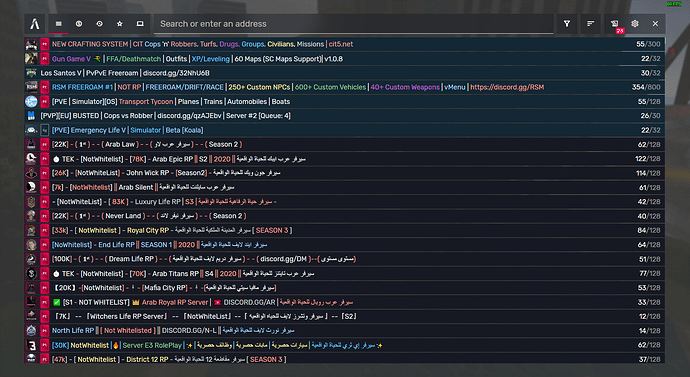
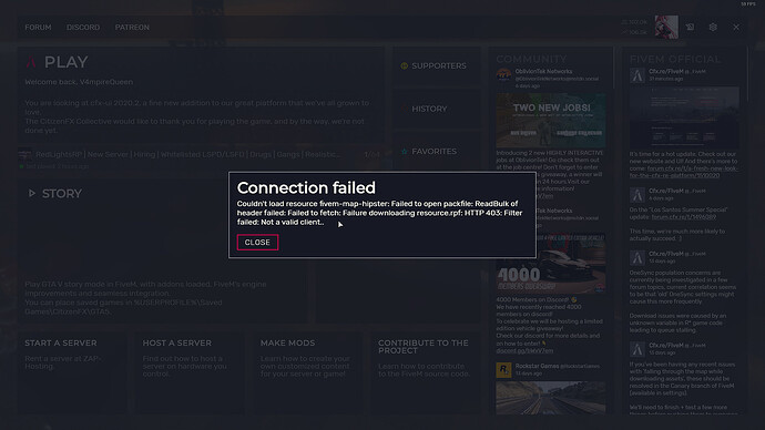
It’s summer. It’s hot. It’s time for a hot update. Today, we present to you a beautiful new design for the FiveM website and the ingame UI!

In the past few weeks we’ve looked at ways to present Cfx.re as a more mature and professional platform. One aspect we really wanted to improve was our design, for a more coherent and sleek experience. As FiveM and RedM continue to grow, we want to give our players the best experience we can provide.

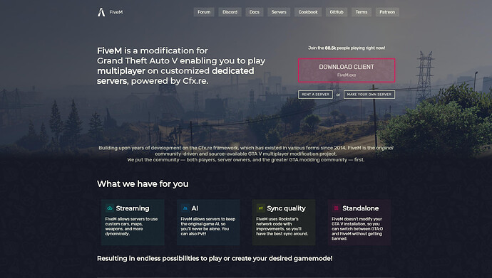
A fresh new website

Building on the content we had, we updated the FiveM website to match our new design language.

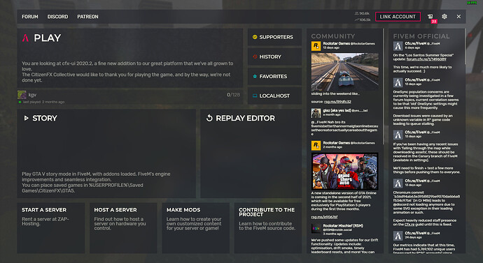
Improved UI

Of course, the update isn’t complete with a new UI for our platform. We aim for an easier experience, and we hope this update is well received. And if you have any feedback, we’re more than happy to hear about it!

For those wondering, Direct Connect is now on the servers page. You can enter any server address in the search field. We’re still improving our user experience, but we’ve heard your feedback. Happy to hear about additional suggestions!

What’s next?

We will soon update the RedM website as well. We’re also looking for a fitting background for the ingame UI, so keep an eye out for that! We know it’s a bit dull right now, but it won’t stay like that. Naturally, all other Cfx.re websites such as the documentation and forums, will receive the design update as well.

Apart from design I want to give a quick update on other developments. Our focus right now is to update FiveM to the Summer DLC. We know you’ve been waiting for this, and are happy to say we do our best to support the latest DLC as soon as possible.
74 Likes

Amazing fresh look!

Can’t wait for the RedM UI updates as well :slight_smile:

1 Like

I love this! Cfx.re is going places. But feel free to disagree but I think it would be better if the FiveM and RedM website was combined just for ease of use and instead just on the cfx.re website. Just to bring the two together more.

3 Likes

Love it! So sleek and professional!

4 Likes

I absolutely LOVE it!

1 Like

I like the new UI in general, let me leave some feedback what can be improved IMO:

  • Button animations in Server Browser tab (Servers/Supporters/History etc.)
  • Some drop down lists have opacity animation (server filter), some haven’t (server sort).
  • Should BOOST server button be filled with accent color?
  • Looks a bit messy:
  • ‘No favourite servers’ or instructions text for empty Favourites tab
  • Don’t understand this red circle near ‘last played’ text on main tab - server is online or does it mean something different?
  • Maybe button icons on main tab should be more noticeable (Supporters/History/Favourites)
  • I would like to see server list buttons on the top - it will improve navigation, just try to click on History, then on FiveM logo, then on History again
  • Not all buttons have tooltips (Changelog, Settings, Close FiveM)
  • Maybe allow to click on twitter feed?
  • Maybe PLAY button require additional highlighting
14 Likes

Fucking awesome. Love the new look. :rocket:

2 Likes

i cant connect since update

3 Likes

I don’t think that has anything to do with the update. Check with your server.

1 Like

Sweet. https://servers.fivem.net/ uses still old UI tho.

2 Likes

i like the new update

1 Like

This is what was needed!!! This is awesome and makes everything so much easier and better

1 Like

It looks really good !
For feedback, here is what i don’t like :

  • new sorting system in server list
  • no back button in settings (clicking fivem logo isn’t really user friendly)

Still, Very good job guys !

3 Likes

I approve, the user experience for new people is not good and not easy to understand how to sort/filter, also i think the search bar is not enough highlited i think moving search bar in another place like in the screenshot here can be a idea to explore:

(don’t judge me that was made in paint)

Also i would love a feature like when you launch FiveM for the first time you need to select the language like in many games.

1 Like

Amazing change. It looks much more professional!

1 Like

Thanks everyone for the feedback! Many good points, we’ll look into them :slight_smile:

Correct, that’s on our to-do list.

6 Likes

Do you mean the summer DLC?

1 Like

Absolutely beautiful, and the new music is great. :smiley:

The only thing that should be fixed is the “lag” that happens when you type text in the search field.

2 Likes

Sorry, yes. Updated the topic.

3 Likes

:open_mouth: looks amazing!

To all at the Cfx.re team, great work! :smile:

2 Likes