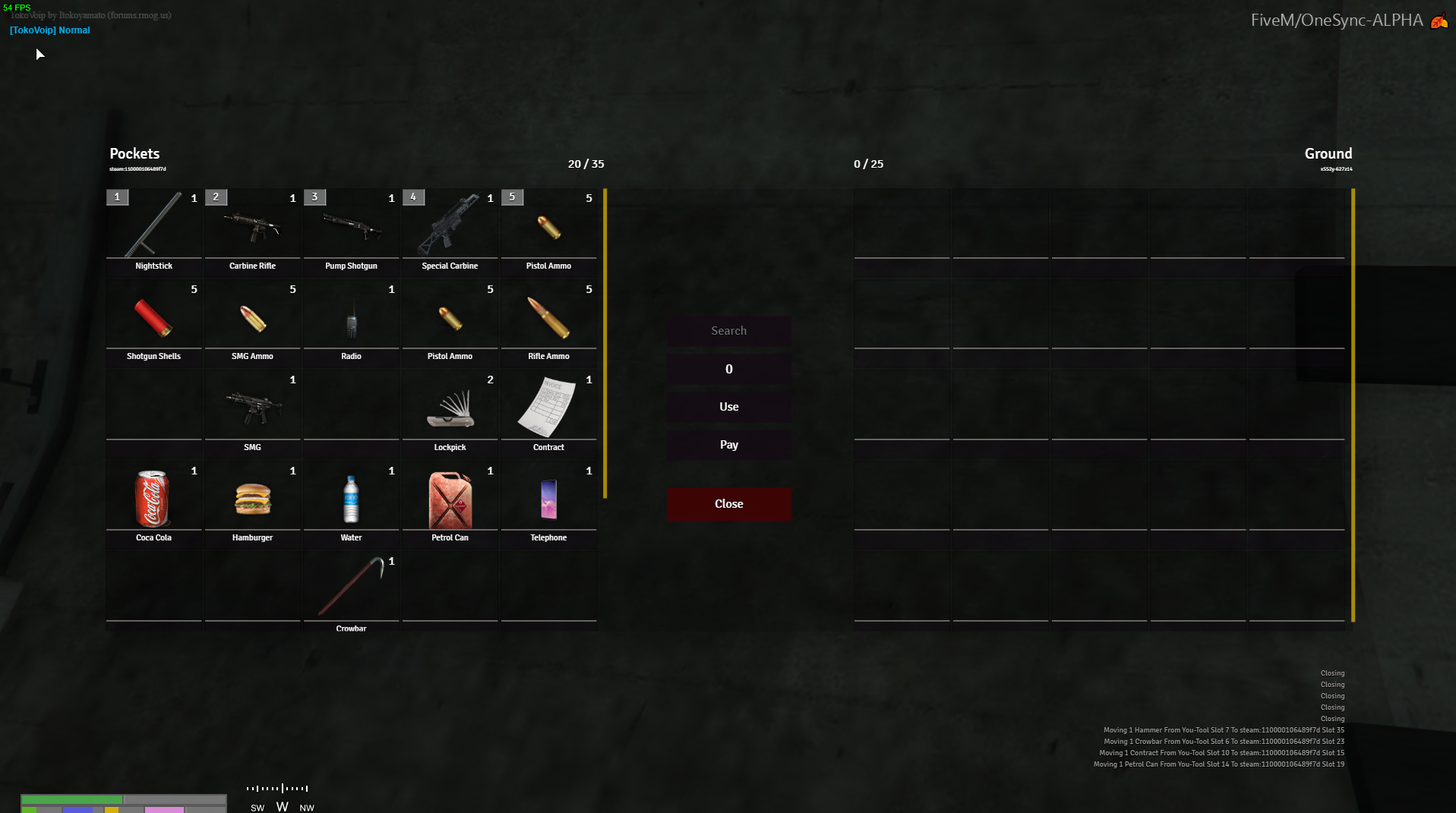
Been messing around a little with my own inventory hud, wanted to get some feedback. Ive sort of just taken the best things from numerous releases and put them into one for the actual menu.
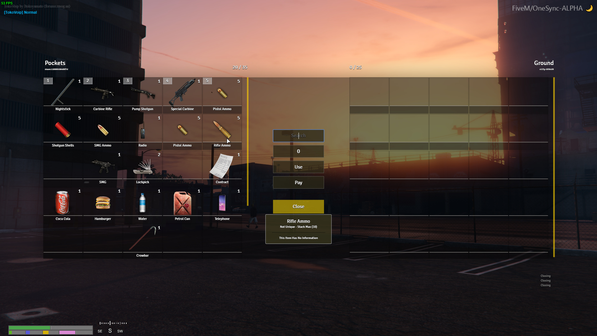
Looks great, but in my opinon the middle buttons (Use, Pay etc.) should have the same theme, they look a bit mis-matched atm. A tip: If you give an item to anyone a small sub-menu pops up. It can also look mis-matched if you don’t have the same theme on it. Besides that it looks like you’ve done a great job!
thanks yeah i know it does look a little out of place now that you mention it…
I wanted the use,pay close to stand out a little more, but i defo agree somethings just not quite right with it. I’ll have a mess around, i appreciate your input.
Also there’s no give function since give functions are easily exploitable and players can dupe items sadly.
also the inventory limits at the top look weird to me but i have no idea where else i could put them
yo great work dude, looks really good would you be thinking about releasing it? . i was thinking about doing this as one of my next to do’s but if your going to release it i shall wait haha 10/10
got to finish some irl assignments for univeristy so progress has been slower than usual. the good news is that I should have the final assignment finished tonight, so i’ll be able to fully dedicate my time to development.
So we’ll see, not sure how long it’ll take. shouldn’t take too long. had a few people private dm me about it, make sure you follow me and you’ll get notified of updates!
Looks good honestly, I prefer a little lighter colour but this is yours and your preference.
In my opinion I would keep it for yourself my guy, If you’re opening a server you will stand out, not just the same old shit but thats on you…
Either people use esx_inventoryhud, Disc_inventoryhud OR custom.