Hello!
Today I am releasing this new script: “sasa-notify”.
This script is made for every server — you can use it for everything you want!
Cost: 4.83€ (With fee)
Main Features:
- Modern and clean design- Multiple notification positions (4 options)
- 2 Styles of notifications (Modern, Oldschool)
- Progress bar support (2 styles)
- Customizable themes (dark and light)
- Client exports
- Server-side events
More info on tebex package description!
Photos:
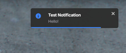
Modern Style, Dark Theme, Bar Progress style
Modern Style, Light Theme, Circle Progress style

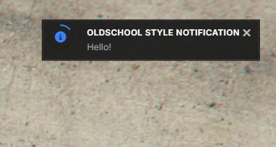
Oldschool Style, Dark Theme, Circle Progress style
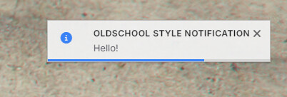
Oldschool Style, Light Theme, Bar Progress style
Config Preview:
View on our docs page by this link
OR
Click on me to show config
--[[
    SASA NOTIFY - Configuration File

    IMPORTANT: Do not modify the structure of this file!
    Only modify values within the Config.DefaultSettings table.

    WARNING: Modifying Config.DefaultValues or Config.ValidOptions may break the script!
]]

Config = {}

-- [[ INTERNAL VALIDATION - DO NOT MODIFY ]] --
Config.DefaultValues = {
    position = 'top-right',
    animation = 'slide',
    style = 'info',
    theme = 'dark',
    notificationStyle = 'modern',
    progressStyle = 'bar' -- default progress style
}

Config.ValidOptions = {
    positions = {'top-right', 'top-left', 'bottom-right', 'bottom-left'},
    animations = {'fade', 'slide', 'bounce', 'nothing'},
    styles = {'success', 'error', 'info', 'warning'},
    themes = {'dark', 'light'},
    notificationStyles = {'modern', 'oldschool'},
    progressStyles = {'bar', 'circle'}
}

-- [[ USER CONFIGURATION - SAFE TO MODIFY ]] --
Config.DefaultSettings = {
    -- NOTIFICATION POSITIONING
    -- Where notifications appear on screen: 'top-right', 'top-left', 'bottom-right', 'bottom-left'
    position = 'top-right',

    -- TIMING
    -- How long notifications stay visible (in milliseconds)
    duration = 3000,

    -- VISUAL EFFECTS
    -- Animation type: 'fade', 'slide', 'bounce', 'nothing'
    animation = 'slide',

    -- FEATURES
    -- Enable/disable the progress bar
    progressBar = true,

    -- PROGRESS BAR SETTINGS
    -- Style of progress indicator: 'bar' or 'circle'
    progressStyle = 'bar',

    -- Progress bar variants
    progressVariants = {
        bar = {
            height = '3px',
            background = 'rgba(0,0,0,0.1)'
        },
        circle = {
            size = '22px',
            thickness = '2px',
            background = 'rgba(0,0,0,0.1)'
        }
    },

    -- QUEUE SETTINGS
    -- Maximum notifications shown at once (prevents spam)
    maxNotifications = 5,
    -- Delay between notifications in queue (milliseconds)
    queueDelay = 250,

    -- THEME SETTINGS
    -- Default theme: 'dark' or 'light'
    theme = 'dark',

    -- NOTIFICATION STYLE
    -- Default notification style: 'modern' or 'oldschool'
    notificationStyle = 'modern',

    -- STYLE VARIANTS
    -- Different looks for notifications
    variants = {
        modern = {
            borderRadius = '6px',
            shadow = '0 2px 5px rgba(0,0,0,0.08)',
            border = 'none',
            blur = false,
            background = {
                dark = 'rgba(44, 44, 44, 0.95)',
                light = 'rgba(245, 245, 245, 0.95)'
            }
        },
        oldschool = {
            borderRadius = '0',
            shadow = '0 1px 2px rgba(0,0,0,0.2)',
            border = '1px solid rgba(0,0,0,0.2)',
            blur = false,
            background = {
                dark = 'rgba(28, 28, 28, 0.95)',
                light = 'rgba(240, 240, 240, 0.95)'
            }
        }
    },

    -- THEME COLORS
    -- Colors for text based on theme
    themes = {
        dark = {
            text = '#ffffff',
            secondaryText = '#a1a1aa'
        },
        light = {
            text = '#18181b',
            secondaryText = '#52525b'
        }
    },

    -- NOTIFICATION STYLES
    -- Icons and colors for different notification types
    styles = {
        success = {
            icon = 'fas fa-check-circle',
            iconColor = '#22c55e'
        },
        error = {
            icon = 'fas fa-times-circle',
            iconColor = '#ef4444'
        },
        info = {
            icon = 'fas fa-info-circle',
            iconColor = '#3b82f6'
        },
        warning = {
            icon = 'fas fa-exclamation-circle',
            iconColor = '#f59e0b'
        }
    }
}

-- [[ TEST COMMAND CONFIGURATION ]] --
Config.TestCommand = {
    enabled = true,
    command = 'testnotify', -- Command to trigger test notification
    style = 'info' -- Default style for test command
}
Links
Tebex
Documentation
Support (Discord): sasinek191
Cost: 4.83€ (With fee)
BUY IT NOW ON TEBEX
| Code is accessible | No |
| Subscription-based | No |
| Lines (approximately) | 750 |
| Requirements | Nothing |
| Support | Yes |