What this is
CSS code that turns the FiveM Docs and Native Reference from white mode to dark mode.
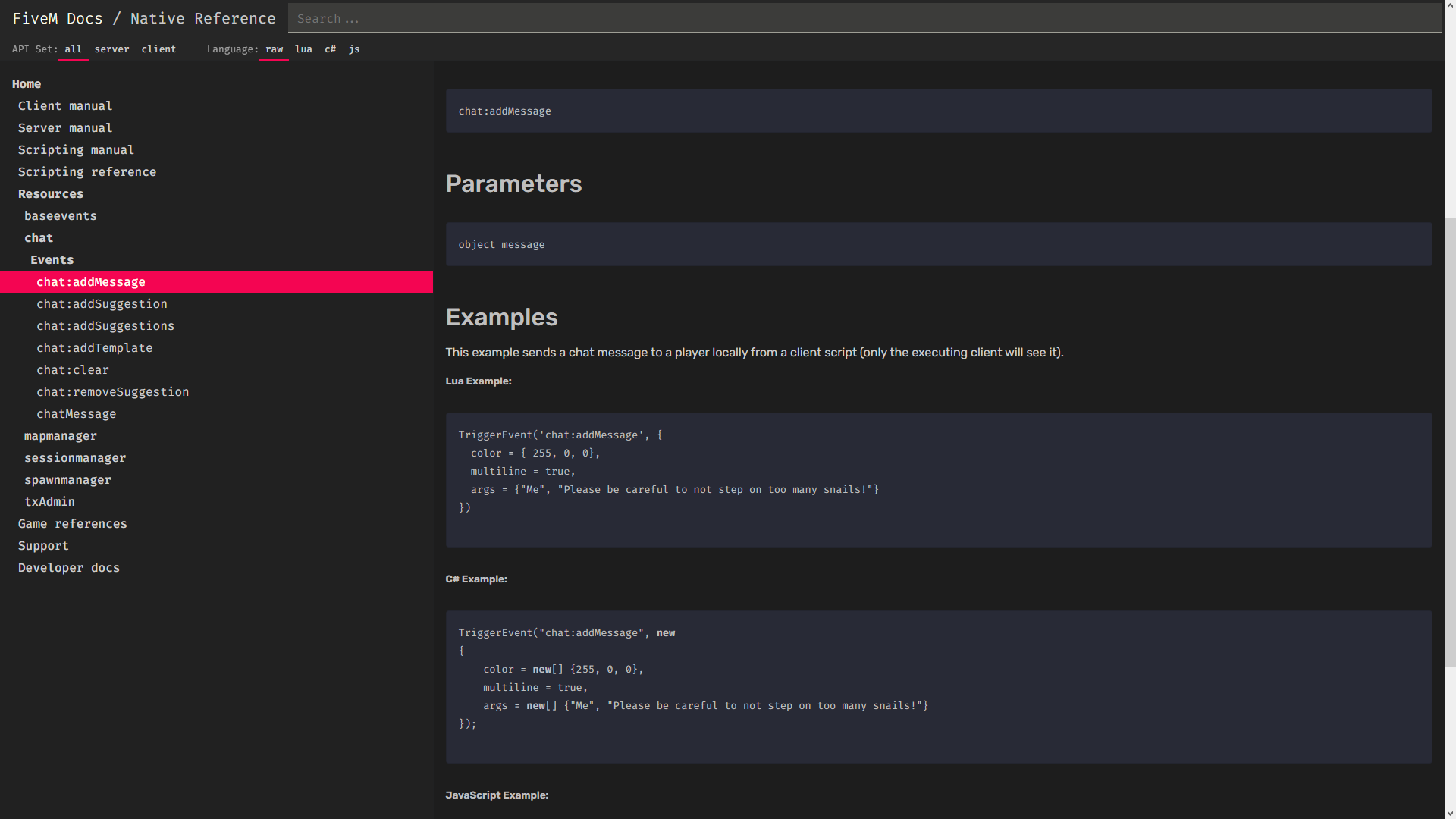
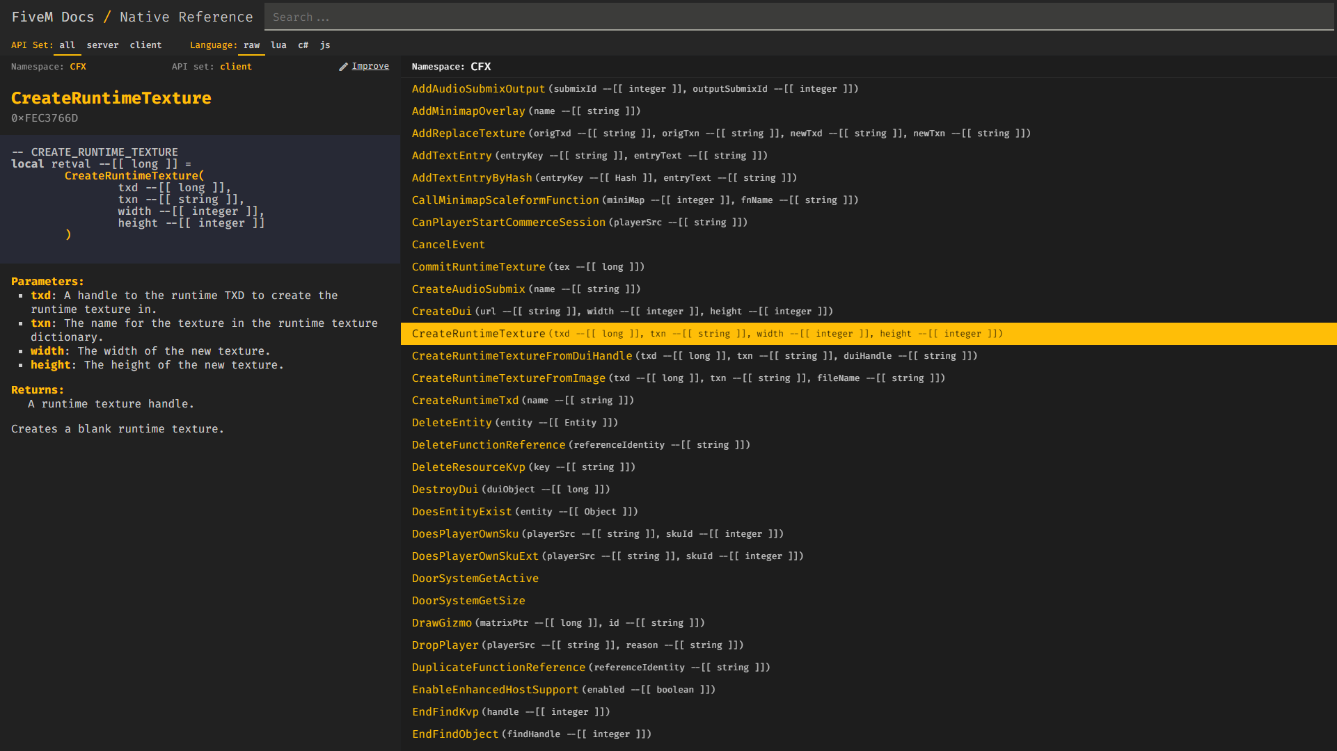
What it looks like
How to use it
You need a browser addon that can load custom CSS. For Firefox I can recommend "Stylus", for Chrome "User CSS" and for Opera / Opera GX "AddCSS". You can use whatever you prefer though, all it needs to do is allow you to use custom CSS code on a specific website.
- Open or start the addon
- Select “docs.fivem.net” when it asks you what website to apply the CSS to
- Paste the following code into the addon:
Code
:root {
	--elevation-0: #121212;
	--elevation-1: #1d1d1d;
	--elevation-2: #212121;
	--elevation-3: #242424;
	--elevation-4: #262626;
	--elevation-5: #2c2c2c;
	--elevation-6: #2d2d2d;
	--elevation-7: #313131;
	--elevation-8: #343434;
	--elevation-9: #373737;
	--code-bg: #282a36;

	--default-text: #cecece;
	--gray-text: #bfbfbf;
	--accent-text: #f40552;
}

body {
	background-color: var(--elevation-1);
	color: var(--default-text);
}

header {
	background-color: var(--elevation-4);
}

nav {
	background-color: var(--elevation-4);
}

nav, div {
	color: var(--default-text);
}

nav, ul, li{
	color: var(--default-text)!important;
}

aside {
	background-color: var(--elevation-2);
}

.docContent pre {
	background: var(--code-bg)!important;
}

code {
	color: var(--gray-text);
}

div .alert {
	background-color: var(--elevation-3);
}

a {
	color: var(--default-text);
}

code, span {
	color: var(--gray-text)!important;
}

.code {
	background-color: var(--code-bg)!important;
}

.examples pre {
	background-color: var(--code-bg)!important;
}

.tsd-index-panel h3 {
    border-color: var(--elevation-7);
}

.tsd-panel {
    background-color: var(--elevation-0);
}

.tsd-panel>h3 {
    border-color: var(--elevation-7);
}

.tsd-signatures {
    border-color: var(--elevation-7);
}
I’m not a good designer or anything so expect things to not look extremely well done or very polished, but I gave it my best shot to make it look somewhat decent. If you have any suggestions on how to make it look even better, then feel free to let me know!
(Also I know that using !important in CSS is not a good thing to do but some rules won’t apply without it.)
Other versions
Better readability by TigoDEV:
6 Likes
Ah jokes on you mine has code syntax!
(jk, good release I struggled a lot with the white theme of it, I just use Opera GX’s dark mode thing XD)
I use GX’s dark mode too sometimes, but as far as I know it applies to every website and some do look more broken with it enabled.
Edit: Just found out that you can actually enable and disable it for certain websites.
No it doesn’t apply for all websites.
I recommend to use “Dark Reader” extension for chrome. It’s the best for view all sites in dark.
 Wow really incredible work, thank you I have been waiting for ages for this!
Not all heroes wear capes 
I like your code, I added some extra lines to make it more readable.
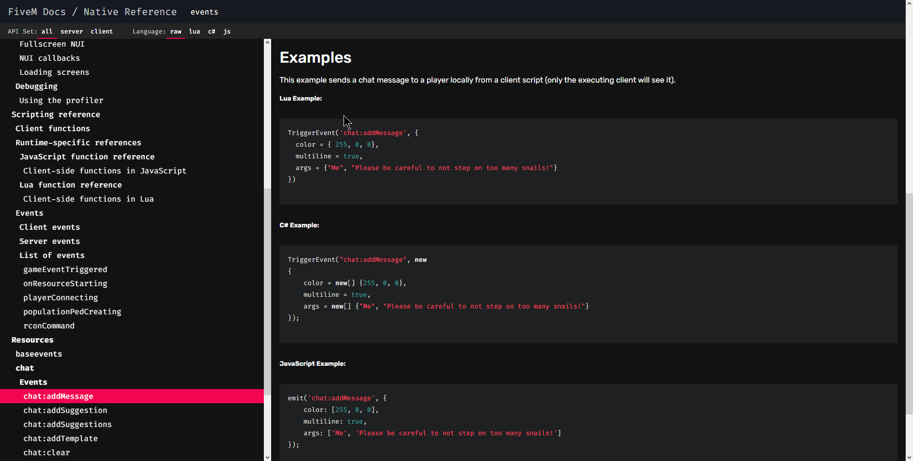
Preview:
CSS Code:
:root, body {
	--elevation-0: #121212;
	--elevation-1: #1d1d1d;
	--elevation-2: #212121;
	--elevation-3: #242424;
	--elevation-4: #262626;
	--elevation-5: #2c2c2c;
	--elevation-6: #2d2d2d;
	--elevation-7: #313131;
	--elevation-8: #343434;
	--elevation-9: #373737;
	--code-bg: #282a36;

	--default-text: #cecece;
	--gray-text: #bfbfbf;
	--accent-text: #f40552;
  --ac: #ffbe07;
}

* {
    scrollbar-width: thin;
    scrollbar-color: var(--ac) var(--code-bg);
    -webkit-touch-callout: none;
    -webkit-user-select: none;
    -khtml-user-select: none;
    -moz-user-select: none;
    -ms-user-select: none;
    user-select: none;
}

*::-webkit-scrollbar {
    width: 12px;
}

*::-webkit-scrollbar-track {
    background: var(--code-bg);
}

*::-webkit-scrollbar-thumb {
    background-color: var(--ac);
    border-radius: 20px;
    border: 3px solid var(--code-bg);
  }

body {
	background-color: var(--elevation-1);
	color: var(--default-text);
}

header {
	background-color: var(--elevation-4);
}

nav {
	background-color: var(--elevation-4);
}

nav, div {
	color: var(--default-text);
}

nav, ul, li{
	color: var(--default-text)!important;
}

aside {
	background-color: var(--elevation-2);
}

.docContent pre {
	background: var(--code-bg)!important;
}

code {
	color: var(--gray-text);
}

div .alert {
	background-color: var(--elevation-3);
}

a {
	color: var(--default-text);
}

code, span {
	color: var(--gray-text)!important;
}

.code {
	background-color: var(--code-bg)!important;
}

.examples pre {
	background-color: var(--code-bg)!important;
}

.tsd-index-panel h3 {
    border-color: var(--elevation-7);
}

.tsd-panel {
    background-color: var(--elevation-0);
}

.tsd-panel>h3 {
    border-color: var(--elevation-7);
}

.tsd-signatures {
    border-color: var(--elevation-7);
}

nav ul li.active {
    box-shadow: 0 -2px 0 var(--ac) inset;
}

.details .code pre[style] code,
.details>h2,
.parameters strong,
.returns strong,
.namespace,
.apiset,
.branding,
.desc p a,
.app>section .entry>a,
.toggles div.title,
.docNav a.active,
.docNav a:hover,
.docContent h3 span {
    color: var(--ac) !important;
    opacity: 1.0;
}

.docContent h1 {
  margin-left: -1rem;
  margin-top: -1rem;
  padding: 0.75rem;
  color: black;
  font-weight: bold;
  font-size: 1.5rem;
  text-transform: uppercase;
  background-color: var(--ac);
  width: calc(100% + 2rem);
}

.docContent h1 span {
  color: black;
}

.app>section .entry.active>a,
header .branding a.active:hover,
header .branding a:hover,
nav ul li:hover,
a:hover,
a:hover span,
.docNav a.docLink.active,
.docNav.active a:hover {
  color: black !important;
}

div.native.entry a span {
  color: white !important;
  opacity: 0.75 !important;
}

.app>section .namespace.entry:hover {
  background-color: transparent !important;
}

div.namespace.entry a {
  color: white !important;
  border-bottom: 1px solid rgba(255, 255, 255, 0.05);
}

div.namespace.entry a span,
.docContent h2 span {
  color: white !important;
  opacity: 1.0 !important;
}

div.active.native.entry a span {
  color: black !important;
  opacity: 1.0 !important;
}

.app>section .active.entry:hover,
.docNav a.docLink.active:hover {
  background-color: var(--ac)!important;
}

.app>section .entry:hover,
.docNav a:hover {
  background-color: rgba(255, 190, 7, 0.05)
}
1 Like