I’m not sure if this was an overlooked bug or an intended feature, if it’s intended then that’s fine but I’d figure I would bring it up. On the new UI currently in Canary, Adaptive Cards’ widths are much smaller than they used to be.
Looking at the card, it should feel like the text shouldn’t try to wrap as soon, since there is still space on either side of the adaptive card. Here is an example:
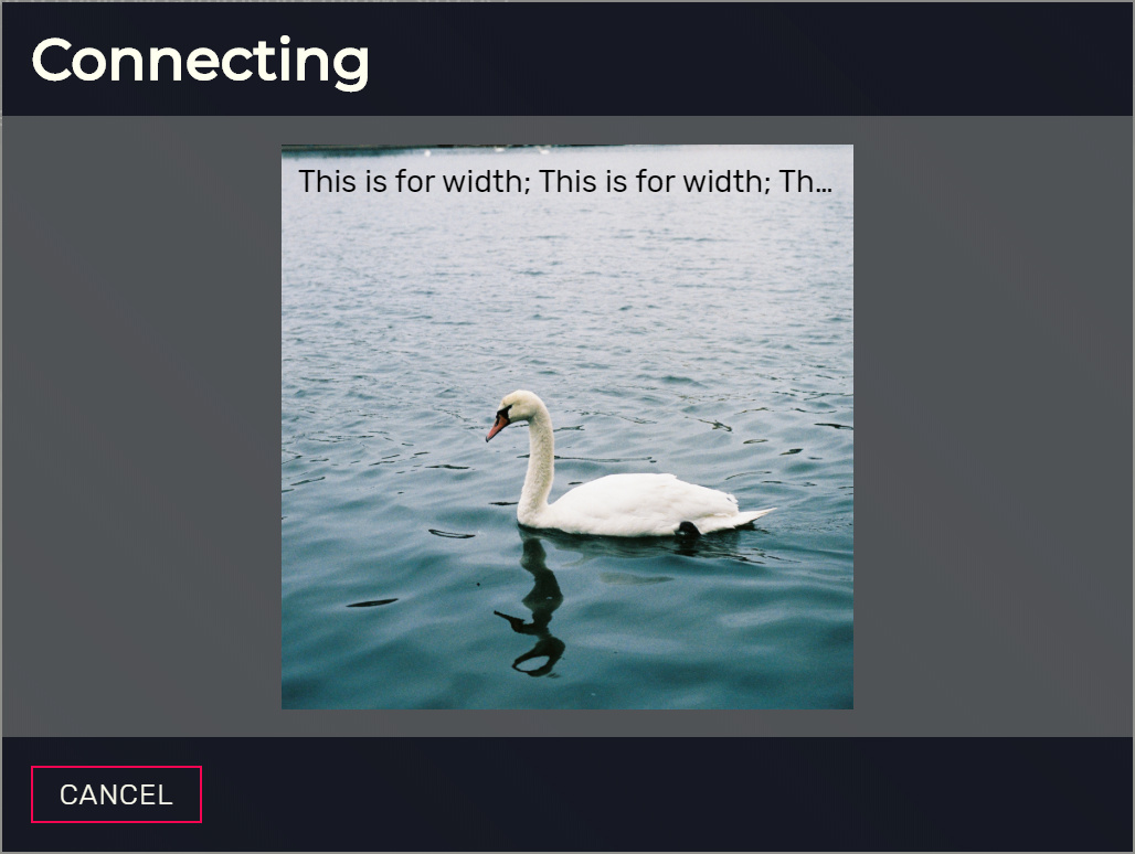
Here I am using 512px as the minHeight on the adaptive card. Here is the full code to the test resource:
AddEventHandler('playerConnecting', function(name, setKickReason, deferrals)
	deferrals.defer()
	deferrals.presentCard({
		type = "AdaptiveCard",
		version = "1.0",
		minHeight = "512px",
		backgroundImage = {
			url = "https://images.unsplash.com/photo-1597182859144-a3aaa5a1bf28",
			fillMode = "cover"
		},
		body = {
			{
				type = "TextBlock",
				text = "This is for width; This is for width; This is for width",
				color = "dark"
			}
		}
	})
end)